
The Natural History Museum’s rebrand by Pentagram and Nomad will try to bring on board a new generation of nature lovers.
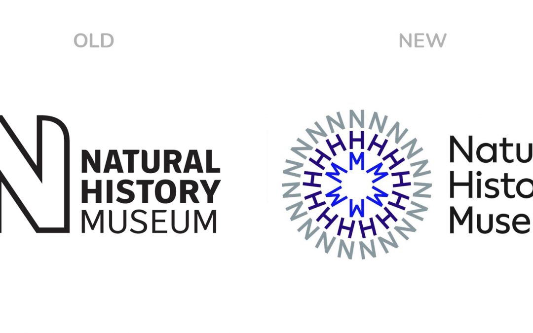
To mark its upcoming 150th anniversary, London’s Natural History Museum has undergone a complete rebrand. A more contemporary visual identity – based on circular motifs and designs – it leans in to application across motion and digital in addition to more traditional application in print, environmental and packaging. At the core of the rebrand are new circular patterns of typographic rings, composed of an acronym of the museum’s name – N H M.
These typographic forms are then paired with dramatic photographs of various wonders of nature waiting to be discovered.
Without doubt this is a well crafted, clever logo design and visual identity. But, we wonder have they left too much of the ‘old’ behind. The Natural History Museum occupies a special place in the hearts, of not just Londoners, but visitors (often repeat) from all over the world. The previous identity had a warmth, familiarity and playfulness (how the N cropped imagery) that will be missed. Short term anyway.
