
Microsoft is replacing Calibri – its default font with a new sans-serif typeface APTOS, created by Steve Matteson. Inspired by 20th century Swiss typography, APTOS is the result of a search by Microsoft for a suitable candidate over the last few years. Microsoft commissioned five fonts, before selecting Aptos after rounds of feedback
Aptos will begin to appear as the new default font across Word, Outlook, PowerPoint and Excel for hundreds of millions of users so this is a font we are going to see a lot.
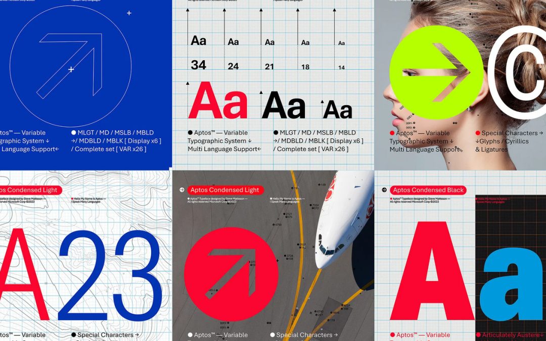
To our eye it’s a clean simple font with a good range of weights, making it suitable for a wide range of applications.
With Aptos the stroke endings are abruptly cut off, but with some softening of curves giving it a humanist touch. A good substitute for Helvetica and Arial, but with its own character.
Full disclosure – I hate Calibri, most likely due to overexposure and poor usage. So a new default font in the Microsoft universe is a welcome change to us – until APTOS too becomes overused…