When is a logo not a logo?
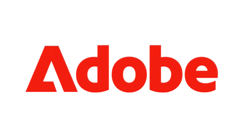
Apparently when it’s Adobe’s new logo (that officially isn’t a logo). And it’s a pity, because we think it’s better than the old/current logo design.
Recently Adobe started to use a new combined version of their ‘Mark’ the stylised Adobe ‘A’ and then ‘dobe’ spelled out in their wonderful Adobe Clean typeface.
To our eye, this is a natural evolution, with removal of the redundant ‘A’. But Adobe insist this is not their new logo. Just a new way of expressing the brand visually.
Hang on a sec… Is this not the very purpose of a logo? To express the brand visually? As designers we have spent years trying to explain the difference between a ‘logo’ and a ‘brand’, and this is not very helpful Adobe. Consistency is at the centre of every successful brand application. The very fact that Adobe felt a need for this new mark to express themselves just indicates to me a shortcoming in the existing logo as a core element of their wider visual identity system.
We have one message to Adobe here. Be confident, evolve and grow, and tell your truth. As a company that plays a huge part in the global creative community don’t confuse and half do things.
For what it’s worth, we think the new mark is a neat evolution of their existing logo – retaining the iconic triangular ‘A’ device, paired with the cleaner balanced weight of Adobe clean.
Even better than the real thing…


